How do I use an SVG to PNG on a responsive website?
Choose the largest rendered width your layout needs, export one or more PNG widths from the same SVG, and serve the smallest suitable file with srcset. Keep the image ratio, test the real CSS box at narrow and wide widths, and inspect the file size before publishing.
Plan the image box before exporting
Start with the component that will display the image, not an arbitrary export size. Write down its widest CSS width and the smallest width at which important details must remain readable. The diagram shows the relationship: the browser box is the design constraint, and the PNG widths are raster choices for it.
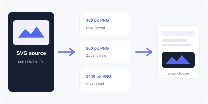
If a content column is 720 CSS pixels wide, a 1440-pixel export is a practical 2x candidate for a dense display. That is a planning example, not a universal requirement. If the image never exceeds 360 CSS pixels, a 2400-pixel file can waste bytes without adding visible detail.
Export a small set of useful widths
- Open the SVG in the converter and set a width for the first PNG candidate. Keep the height proportional unless the design intentionally changes aspect ratio.
- Repeat for the other widths needed by the layout, such as small, medium, and large candidates. Use the same source SVG for every export.
- Check each PNG at its intended display width. Look for thin lines, small labels, transparent edges, and unwanted cropping.
- Compare file sizes. Remove unnecessary detail from the source or choose a more suitable width when the image is much larger than the layout can display.
Planning rule: PNG width = intended CSS display width x density target.
For a 480 CSS-pixel image at a 2x target, the planning value is 480 x 2 = 960 pixels. Replace the example inputs with the actual component width and quality target.
Let the browser choose with srcset
Put the exported files at stable public URLs and offer their intrinsic widths in srcset. Replace the example names and dimensions with the files you actually exported.
<img
  src="/images/diagram-960.png"
  srcset="/images/diagram-480.png 480w,
          /images/diagram-960.png 960w,
          /images/diagram-1440.png 1440w"
  sizes="(max-width: 720px) calc(100vw - 32px), 720px"
  width="720" height="405"
  alt="A short description of the diagram's meaning">
The width and height attributes describe the intended ratio and help the page reserve space before the image arrives. They do not turn a small PNG into a sharp large one. Keep the source files' ratio consistent with those attributes.
Check the rendered page and request
| Symptom | Check |
|---|---|
| Soft on a wide screen | Confirm the selected candidate is wide enough for the CSS box and the browser is not given only one small PNG. |
| Cropped image | Compare the SVG viewBox, PNG ratio, CSS box, and any object-fit: cover rule. Use contain when the full artwork matters. |
| Mobile feels slow | Inspect the requested image and review the sizes expression against the actual layout width. |
| Layout jumps | Keep matching width and height attributes or an equivalent aspect-ratio rule. |
| Text is unreadable | Simplify the SVG or enlarge the text. More PNG pixels preserve detail; they do not change text proportions. |
Test at the narrowest and widest real layout widths, then open the image URL directly in a private window to confirm it is public. Keep the SVG beside the generated PNGs so the next edit does not require rebuilding artwork from a raster file.
FAQ
Should I replace every SVG with PNG?
No. Keep SVG when your browser, design system, and accessibility needs support it. Export PNG when a fixed-pixel asset or raster fallback is required.
How many PNG widths should I make?
Make the smallest set that covers the actual responsive boxes and density targets. Three widths are an example, not a platform rule.
Can the converter host my website image?
No. Conversion runs in this browser tab and produces a download. Publish the PNG on your own site or asset host, then test its public URL.